
鸿蒙开发基础5-组件的背景图使用和大小的设置及布局方式,层级定位
下面我们直接来看例子
@Entry
@Component
struct BgImage {
build() {
Column({ space: 20 }) {
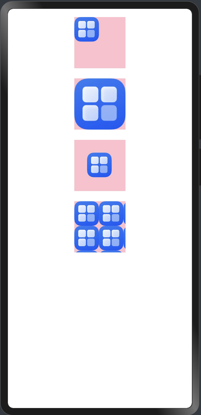
// 图片的默认的大小展示
Image('')
.width(100)
.height(100)
.backgroundColor(Color.Pink)
.backgroundImage($r('app.media.startIcon'))
// 图片的大小展示
Image('')
.width(100)
.height(100)
.backgroundColor(Color.Pink)
.backgroundImage($r('app.media.startIcon'))// 让背景图居中显示
// 背景图显示的尺寸 是展示默认大小 还是完全占满
.backgroundImageSize(ImageSize.Cover)// 背景图显示的尺寸 等比例缩放到高或者宽至附件的范围为止
.backgroundImageSize(ImageSize.Contain)
// 背景图展示的位置
Image('')
.width(100)
.height(100)
.backgroundColor(Color.Pink)
.backgroundImage($r('app.media.startIcon'))// 让背景图居中显示
.backgroundImagePosition(Alignment.Center)// 该属性可以单独设置x y的值
.backgroundImagePosition({
x: 25,
y: 25
})
// 背景图的平铺方式
Image('')
.width(100)
.height(100)
.backgroundColor(Color.Pink)// 让背景图平铺显示
.backgroundImage($r('app.media.startIcon'), ImageRepeat.XY)
}
.width('100%')
.padding(16)
}
}运行效果如下图 可以直接看
组件的布局方式
通过给Column 设置 FlexAlign 的属性是个枚举有很多种属性 需要自己尝试下 但是使用方式都不难
.justifyContent(FlexAlign.SpaceEvenly)另外row的布局方式基本可以说跟Column的布局方式的差不多的 只是他们针对的主轴不一样
Column是以纵轴为主轴 row是以横轴为主轴的方式
下面说下交叉轴的设置方式
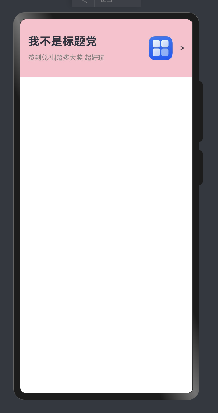
alignItems(HorizontalAlign.Center)最后来一个实例 大家可以感受下效果
@Entry
@Component
struct TestContent {
  build() {
    Column() {
      // 列表
      Row() {
        Column({ space: 12 }) {
          Text('我不是标题党')
            .fontSize(24)
            .fontWeight(FontWeight.Bold)
          Text('签到兑礼|超多大奖 超好玩')
            .fontSize(14)
            .fontColor(Color.Gray)
        }
        .alignItems(HorizontalAlign.Start)
        .margin({ left: 16 })

        Row({ space: 16 }) {
          Image($r('app.media.startIcon'))
            .width(50)
          Text('>')
        }
        .margin({ right: 16 })
      }
      .width('100%')
      .height(120)
      .backgroundColor(Color.Pink)
      .margin({ left: 16, right: 16 })
      .justifyContent(FlexAlign.SpaceBetween)
    }
  }
}
用到的图片资源是项目默认生成的 复制我的代码 运行界面预览器 应该就可以看到跟我一样的效果了
布局中权重的问题
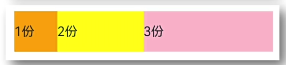
通过以下属性就可以设置权重比例了 直接设置对应的数值 然后在对应的行或者是列 会进行加运算后再按比例分配
.layoutWeight(1)如果一行有一个动态长度显示的文本 一个固定显示的按钮 那么就可以给文本添加上这个属性 这样系统就会将按钮固定在一边 然后文本的长度就会是最大化的长度
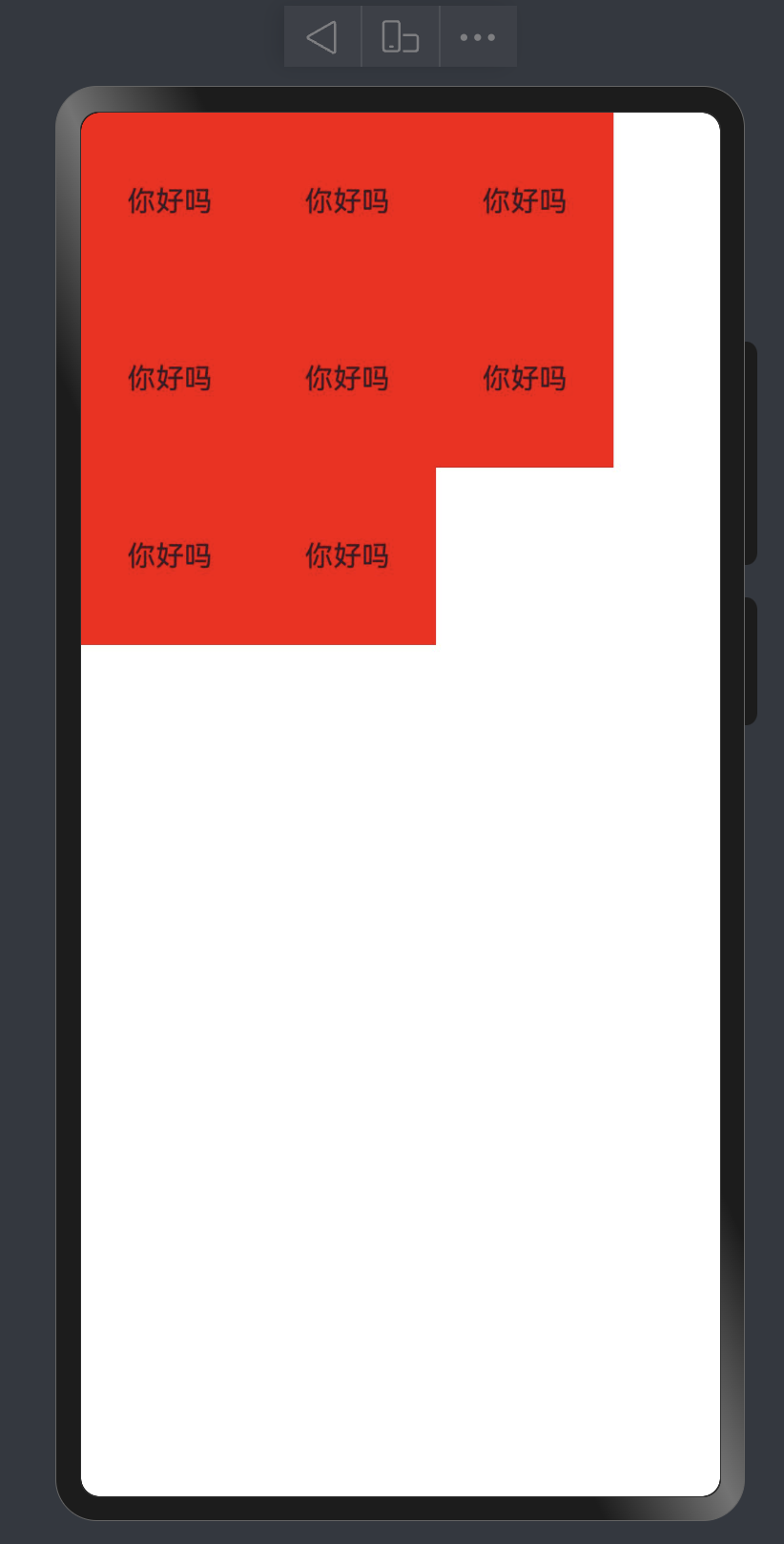
弹性布局
弹性布局组件Fle()组成的
其他它和我们上面所讲到的主轴和副轴的对称方式差不多 用法上就点差异
我这里提供了一种样式效果 其他的效果 可以自行测试
Flex( {
  // direction:  Column
  wrap: FlexWrap.Wrap
}) {
  Text('你好吗')
    .width(100)
    .height(100)
    .textAlign(TextAlign.Center)
    .backgroundColor(Color.Red)

  Text('你好吗')
    .width(100)
    .height(100)
    .textAlign(TextAlign.Center)
    .backgroundColor(Color.Red)

  Text('你好吗')
    .width(100)
    .height(100)
    .textAlign(TextAlign.Center)
    .backgroundColor(Color.Red)

  Text('你好吗')
    .width(100)
    .height(100)
    .textAlign(TextAlign.Center)
    .backgroundColor(Color.Red)

  Text('你好吗')
    .width(100)
    .height(100)
    .textAlign(TextAlign.Center)
    .backgroundColor(Color.Red)

  Text('你好吗')
    .width(100)
    .height(100)
    .textAlign(TextAlign.Center)
    .backgroundColor(Color.Red)

  Text('你好吗')
    .width(100)
    .height(100)
    .textAlign(TextAlign.Center)
    .backgroundColor(Color.Red)

  Text('你好吗')
    .width(100)
    .height(100)
    .textAlign(TextAlign.Center)
    .backgroundColor(Color.Red)
}
绝对定位和层级
如果某个组件需要设置成层叠效果 那么就可以用绝对定位来做 下面我们来看一段代码
@Entry
@Component
struct Count {
  @State name: string = '你好啊'

  build() {
    Column() {

      Column() {
        Text()
          .backgroundColor(Color.Red)
          .width(200)
          .height(200)

        Text('VIP')
          .width(60)
          .height(20)
          .fontColor(Color.Green)
          .backgroundColor(Color.Orange)
          .textAlign(TextAlign.Center)
          .borderRadius( {
            topLeft: 12,
            bottomRight: 12
          })
          .border({
            width: 1,
            color:Color.White
          })
          .position({
            x: 0,
            y: 0
          })
      }
      .width(200)
    }
    .width('100%')
  }
}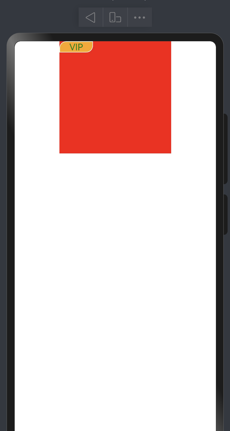
这里涉及到了几个知识点 一个是前面学到的给指定方向添加圆角和圆角边框 再就是层级定位.position 通过设置x y值也可以将定位的位置进行偏移
另外通过设置 下面这个属性也可以让组件的层级发生变化 里面的值越大 表示层级越高越靠上面
.zIndex(1)层叠布局Stack
当我们有多个层级需要叠在一起的时候的 就可以用到这个组件 看了上面的定位和更改层级变化 再理解这个就不难了 这个是专门用于解决上面问题的组件 显然这个会更高效 我们可以根据情况来定 如果只是简单的一两个组件需要解决层级问题 那我们就可以用上面说 如果是比较复杂的场景就用Stack布局解决
本文是原创文章,完整转载请注明来自 MrXiao's Blog
阅读建议
评论
匿名评论
隐私政策
你无需删除空行,直接评论以获取最佳展示效果